Brand Standards
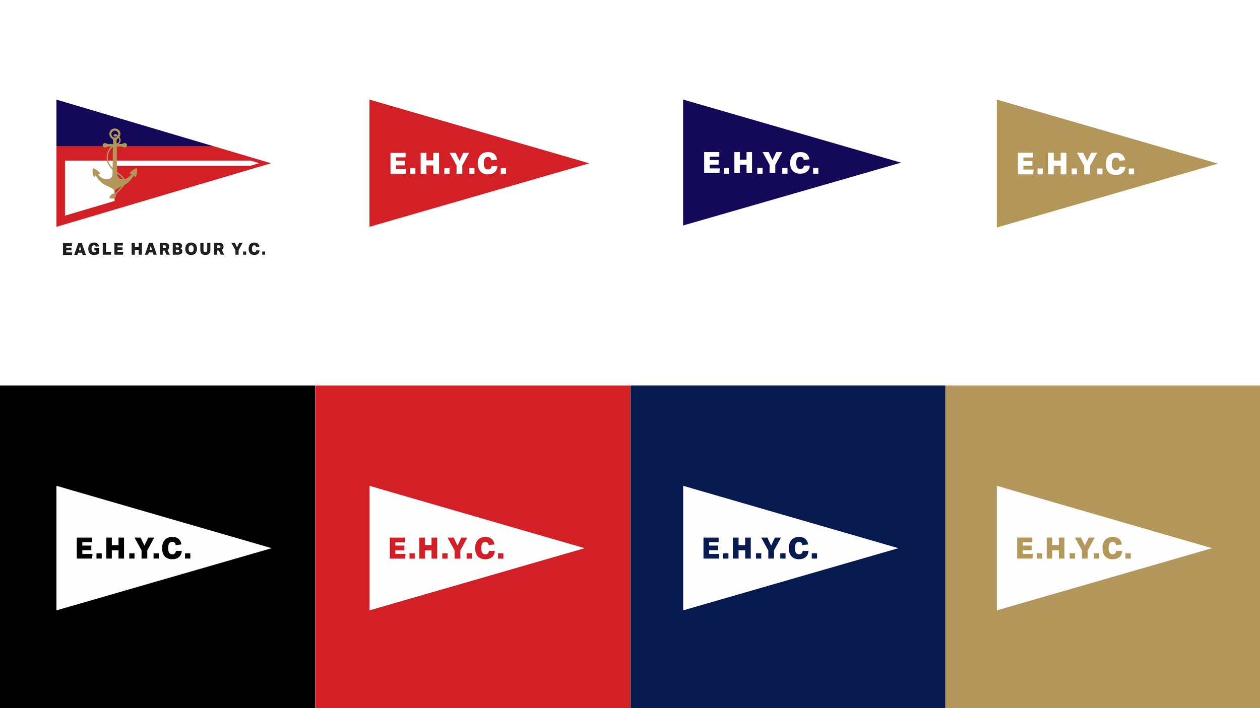
Our Colours
Based on our original flag design, the EHYC logo utilizes four brand colours across all brand media and touchpoints.

Our Logo
A suite of logo options designed to accommodate every scenario.
WRITING RULES
*This is an evolving document to guide all club members on how to write clearly and effectively for our club communications.
The overall goal of writing for advertising and marketing is to communicate clearly and quickly because people don’t have time (or aren't willing to take the time) to read long passages when they just want a quick bit of information. This means you can break grammatical rules when needed, but it’s always good to try to stay true to them when you can.
Write like you would speak to someone, as opposed to how you were taught in school.
Always keep headlines and subheads as short as possible.
Exclamation points are for yelling, not showing excitement. Let the words you use express excitement or urgency.
TYPOGRAPHY
Helvetica Neue is our primary typeface for communications. It’s used for all official content, from email campaigns, website and event posters. It’s clear, neutral and ubiquitous. Arial is used as a fallback on Windows machines.
Helvetica, also known by its original name Neue Haas Grotesk, is a widely used sans-serif typeface developed in 1957 by Swiss typeface designer Max Miedinger and Eduard Hoffmann. Helvetica is a neo-grotesque design, one influenced by the famous 19th-century typeface Akzidenz-Grotesk and other German and Swiss designs.
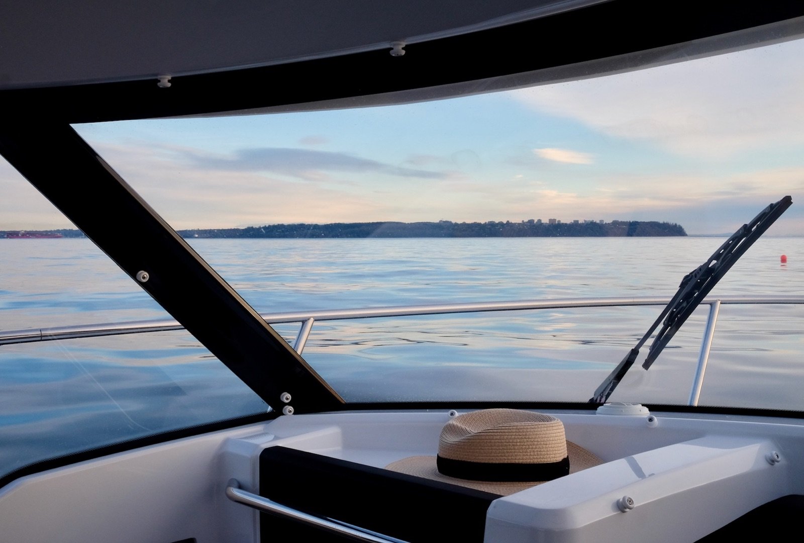
Photography
Photos should promote the culture of sailing, boating and life on the Coast. Everyone has a Smart Phone so let’s find those friends that shoot on professional cameras.